Wednesday 14th May was a particularly stunning day for myself. Not only did I finally teach a lesson good enough to be judged ‘outstanding’ by Ofsted, but the data that I produced also helped us do well in the inspection overall.
First, some context. Ofsted are the National body in the UK that inspects state-funded education. Recently (January 2012) a new inspection framework was produced that streamlined some 22 categories into only 4. Consequently, we had begun hearing some horror stories of many schools in our area moving down a category – it seemed it was harder to average out at the same grade you had previously been on. Ofsted judges schools in one of 4 ways: 1 – Outstanding, 2 – Good, 3 – Satisfactory and 4 – Inadequate.
Of course, our fears were that we would move down a category, losing our good status to take on that dreadful label – ‘satisfactory’. It was not to be. We came out as a ‘Good’ school and the report reads particularly well (I think).
So what of the data?
Well, we knew in our hearts that we do a good job for our children. The school is set in a part of Birmingham within the highest 20% of deprivation in the country. The children enter the school well below average and leave the school broadly in-line with national expectations, but how could we prove that in numbers?
It was a function and 3 Google Spreadsheets that came to the rescue.
I keep tracking sheets for reading, writing and mathematics for all students and looking at them, I could see that the children who we’ve taught for a while achieve better than those who’ve just joined us. In other words the children we teach, do well; we have a small but significant group of children who join us late and don’t make as much progress.

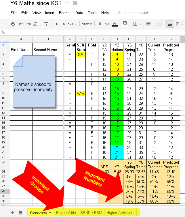
So I used my Google Spreadsheets to calculate a range of measures from current attainment in each subject, to the progress being made. The function that helped me the most was the ‘countif’ function – I’d recommend finding out how it works if you don’t already – there’s guidance within both Excel and Google Docs.
I used the countif function to help me calculate 12 important numbers for each group – overall, boys, girls, SEND (special educational needs or disabled), FSM (free school meals) and higher achievers. This data showed that all groups who had been taught by us through the Key Stage 2 department (ages 7 to 11) were achieving at or above national expectations
In addition, a second sheet showed that in each year group, progress in reading, writing and maths was good or outstanding.
In all, I used the spreadsheets to calculate 363 separate numbers to demonstrate to Ofsted that we are still a good school.
I was helped in this process because we use an assessment system called Incerts, which fills up my spreadsheets with meaningful numbers from teacher’s assessments. Once we demonstrated that our monitoring of this assessment was effective by analysing current samples of teacher assessments in books, the inspection team were content to believe that our data did indeed demonstrate that we are doing a good job for our children.
And next time we’ll be ready to argue for ‘outstanding’.

Well done everyone at Pagenal school! It’s so difficult to balance creatiitity and accountability and TEACHER WORKLOAD. It looks like you’ve cracked this and held on to the innovation that I know takes place at your school. Very well done